Radio Contact
Client
Radio Contact
Sector
Media
Category
Branding & créativité
Start of the collaboration
February 2024
Radio Contact
Media
Branding & créativité
February 2024
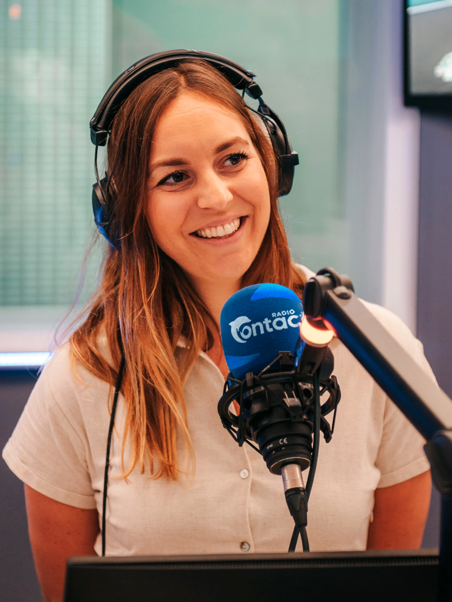
After more than 40 years, Radio Contact decided to update its logo and entire brand identity to open a new chapter. With thousands of artists, songs, and millions of listeners every year, it remains one of the most beloved radio stations in the Belgian media landscape.
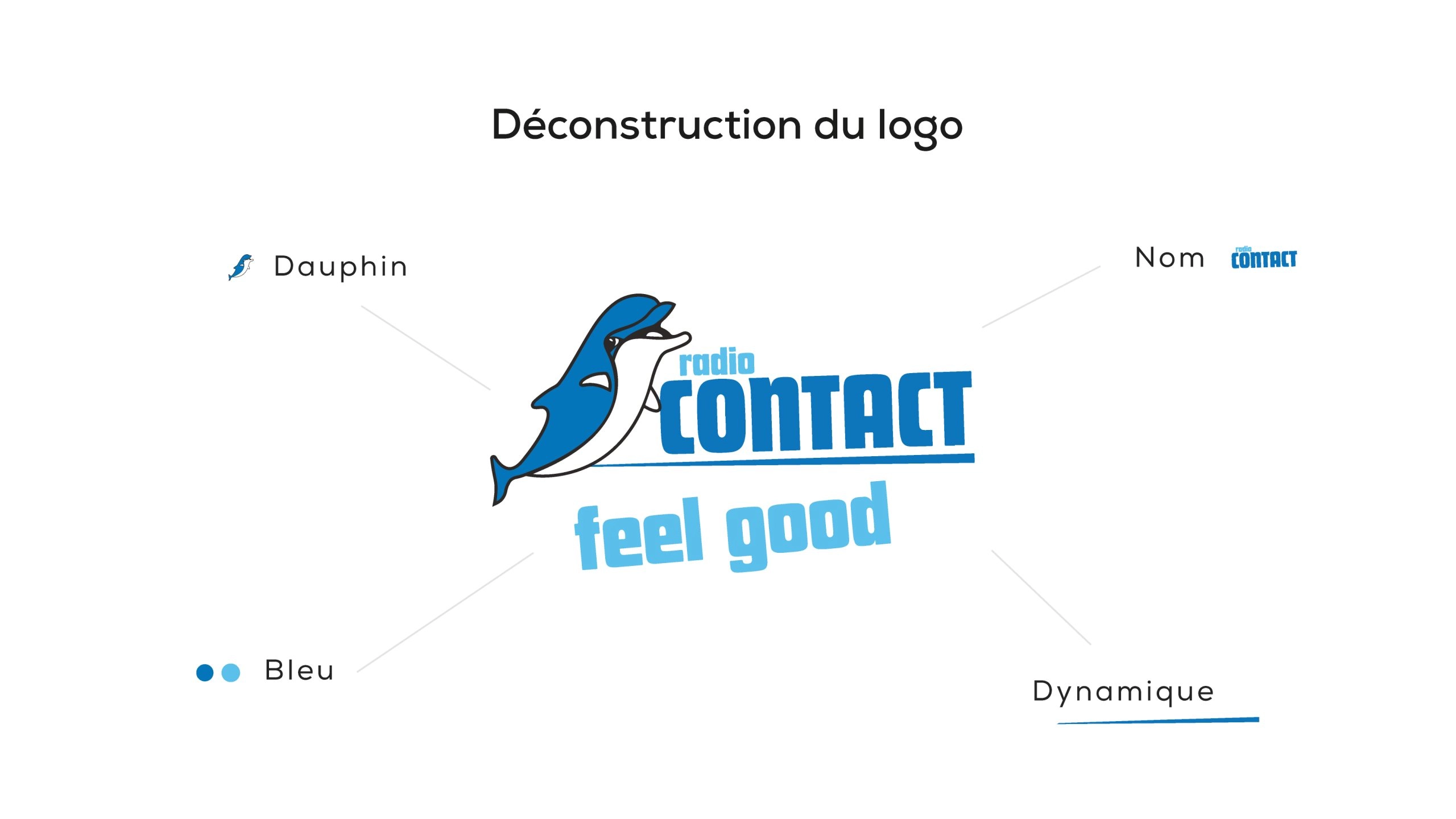
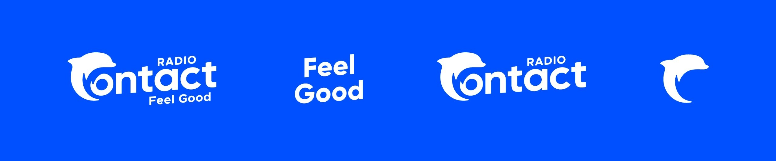
Redesigning a logo that has stood as the logo for over 40 years is a challenge that requires a deep understanding of the brand. Behind Radio Contact’s identity lies a story, a family, emotions, and, of course, an iconic dolphin that has accompanied millions of Belgian listeners.
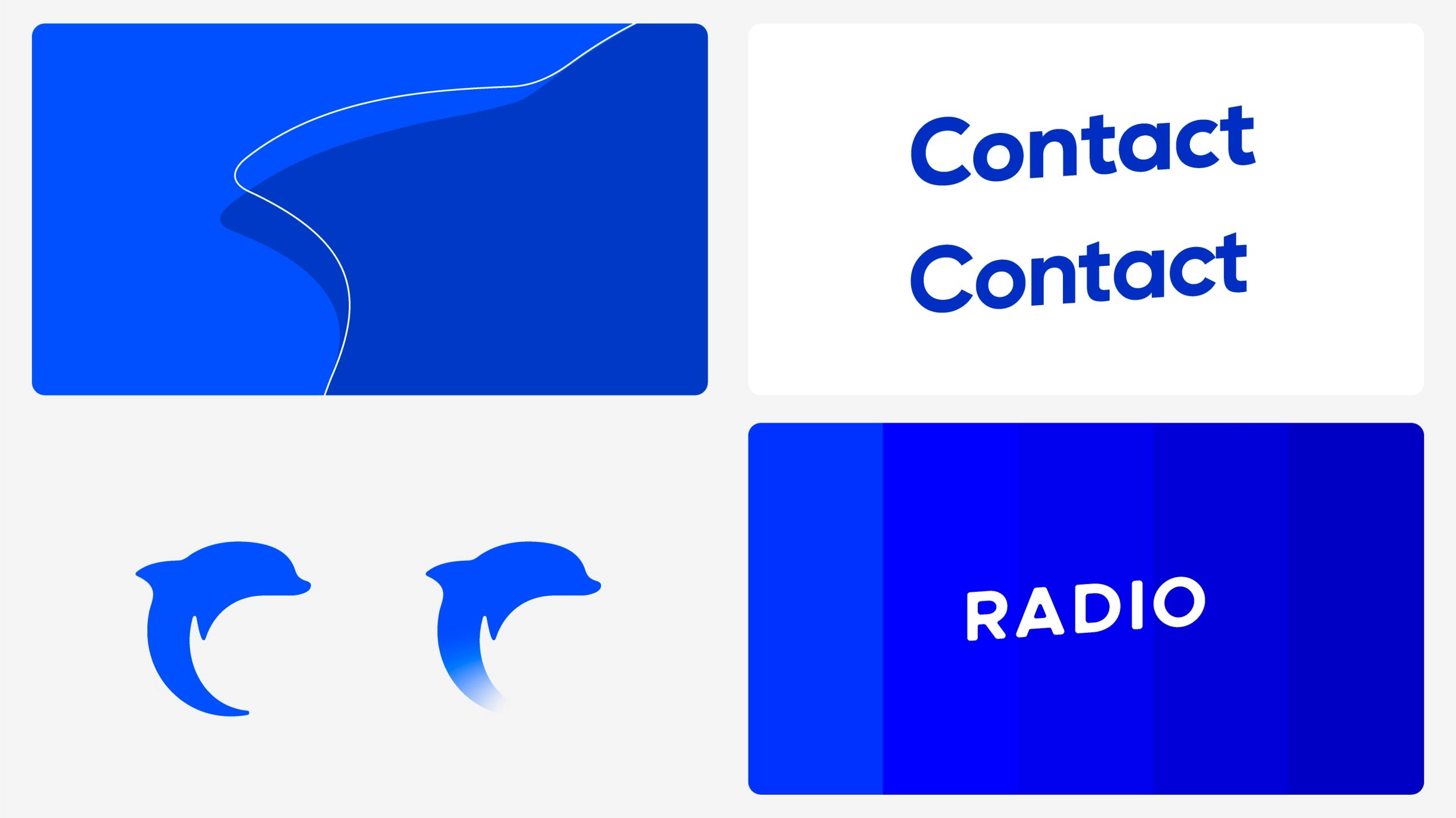
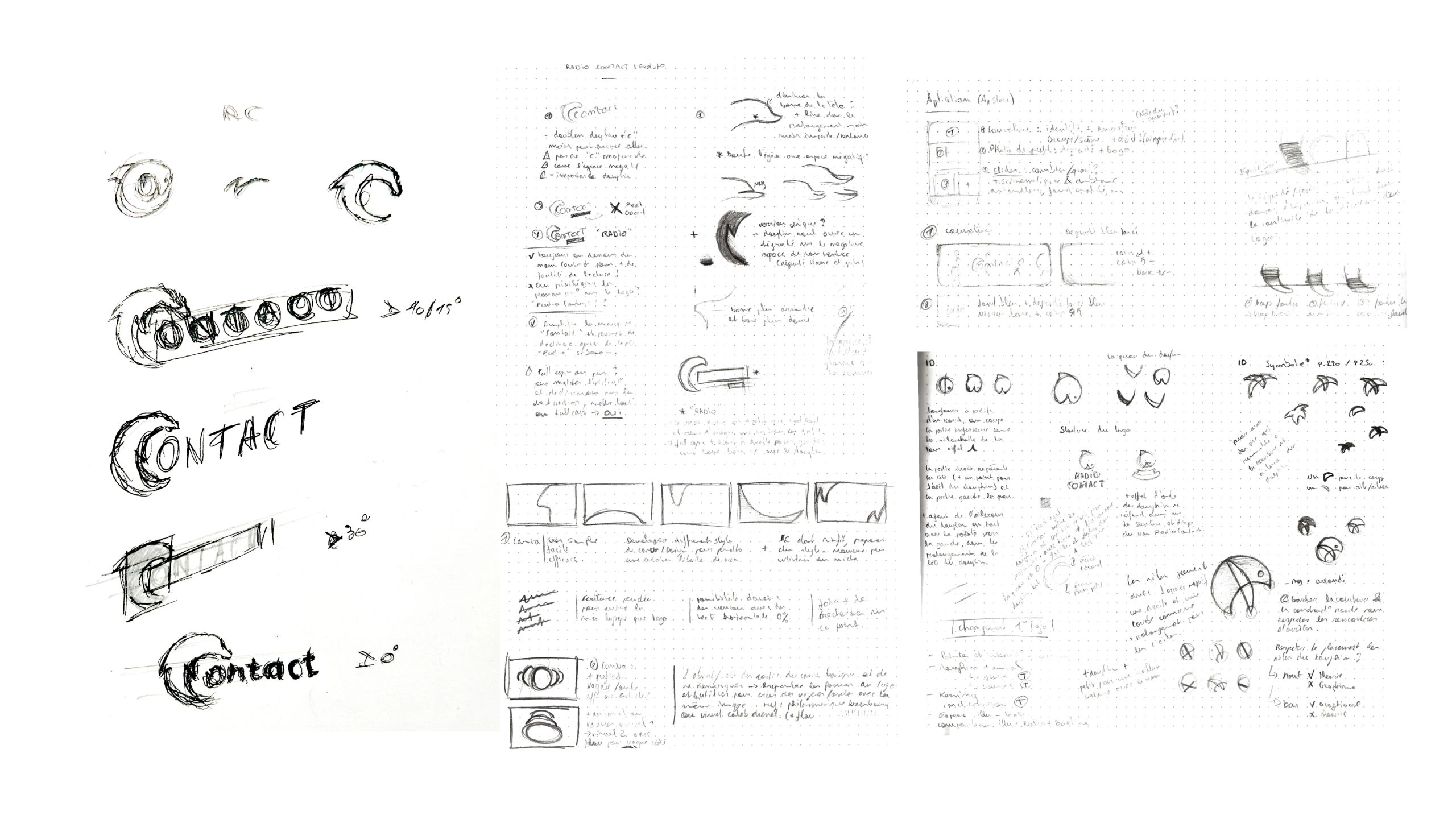
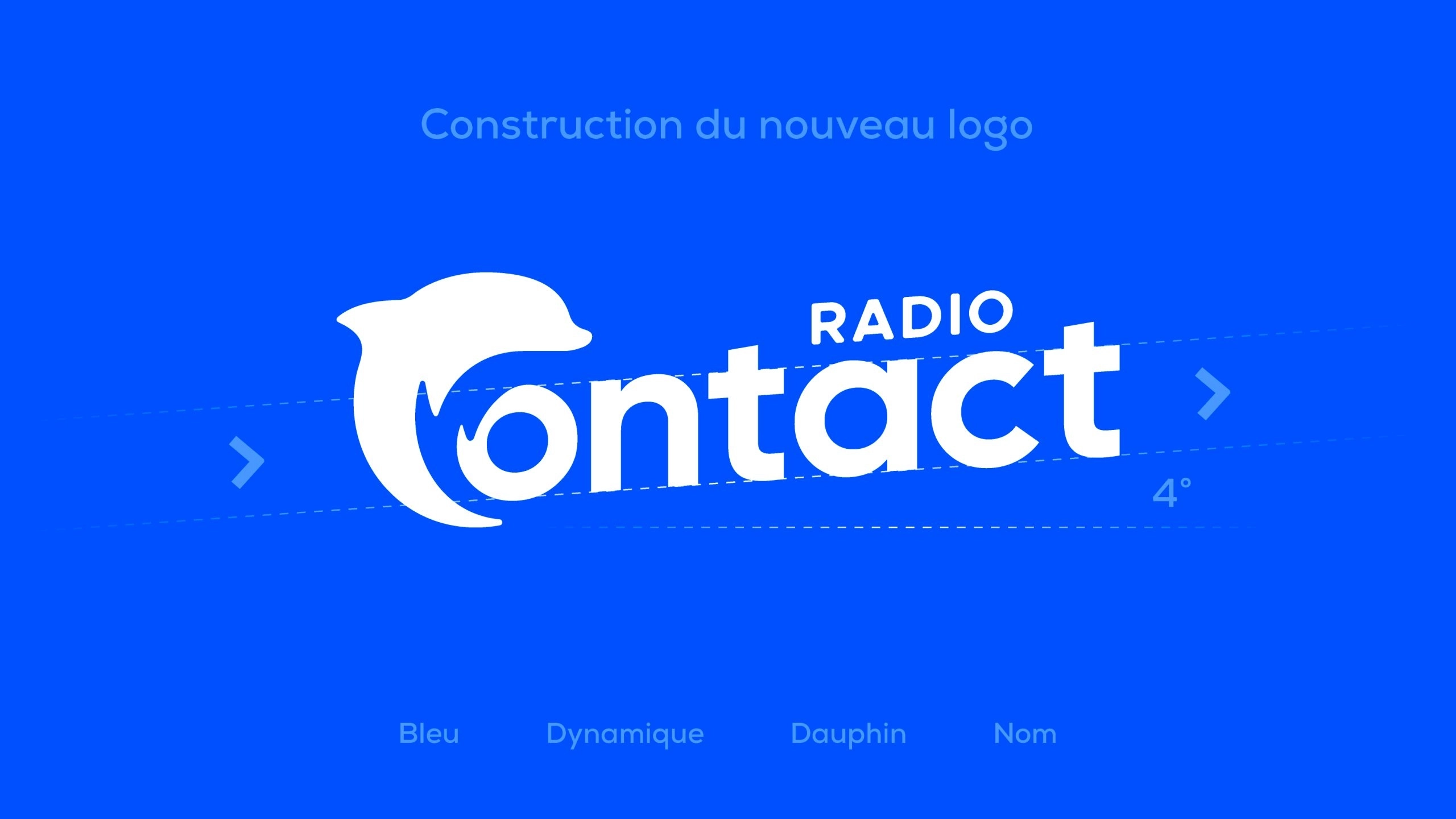
We completely deconstructed the logo to analyze its key elements : the dolphin, the brand name, the signature blue color, and the logo’s dynamic energy. The goal was to create a logo that continues the legacy of the original, to write the next chapter in the radio’s story, starting from its roots. The real challenge was winning over the audience while preserving the dolphin’s essence and the vibrant energy it conveys.
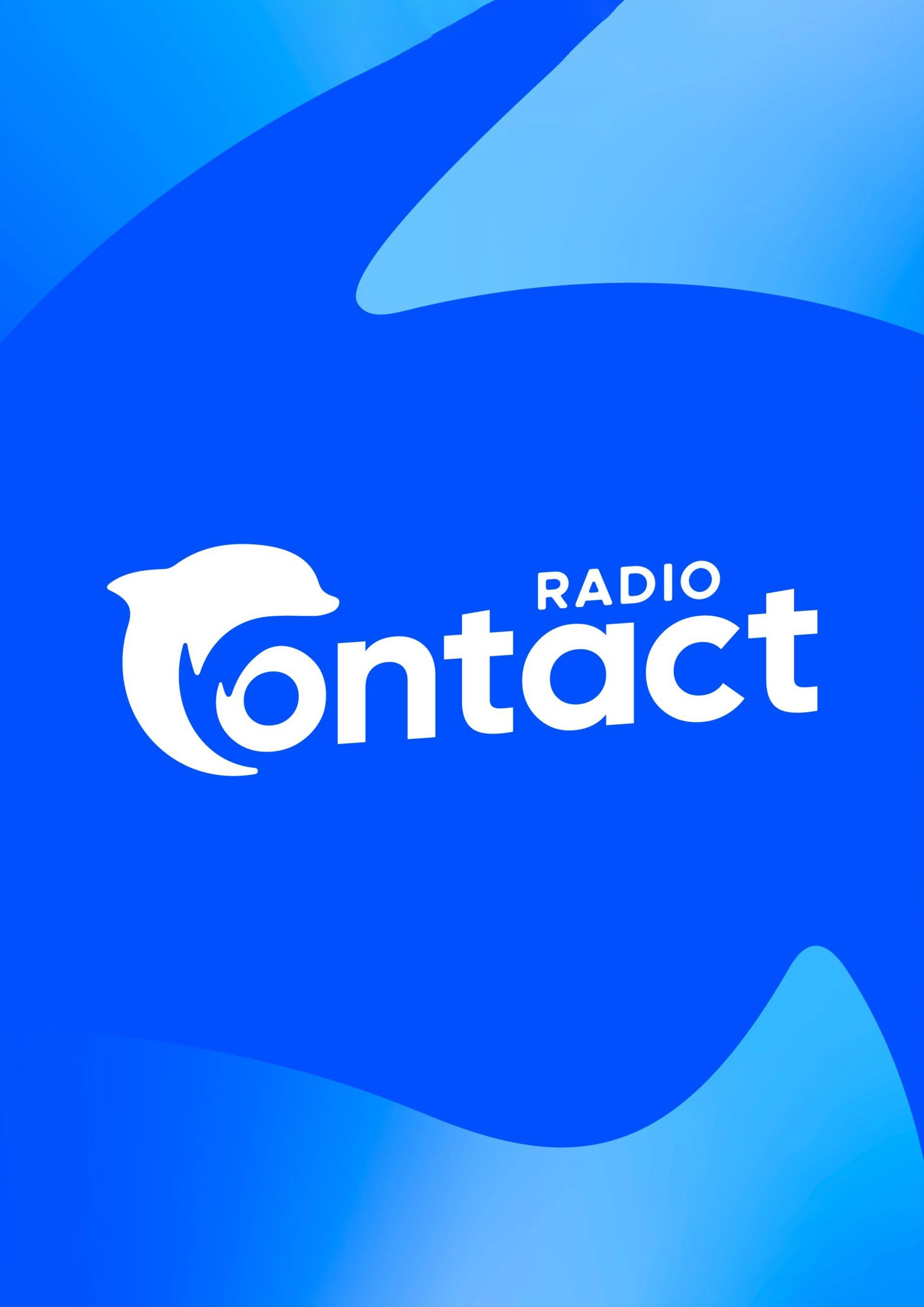
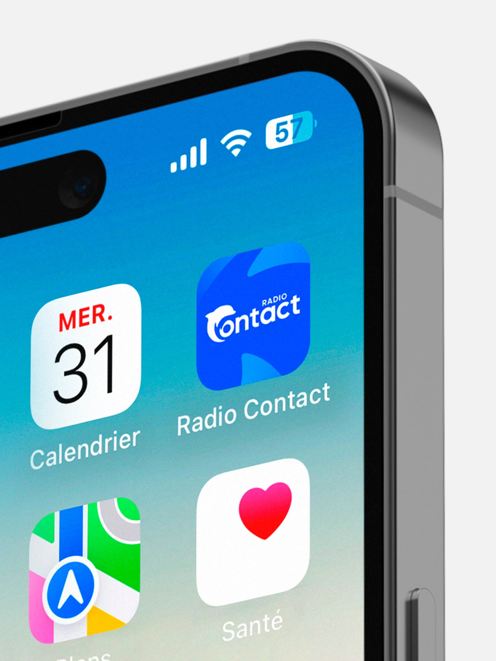
The dolphin being an integral, indeed inseparable, part of Radio Contact, we were driven to fully integrate it into the logo, merging it seamlessly with the brand name to become one unified symbol.
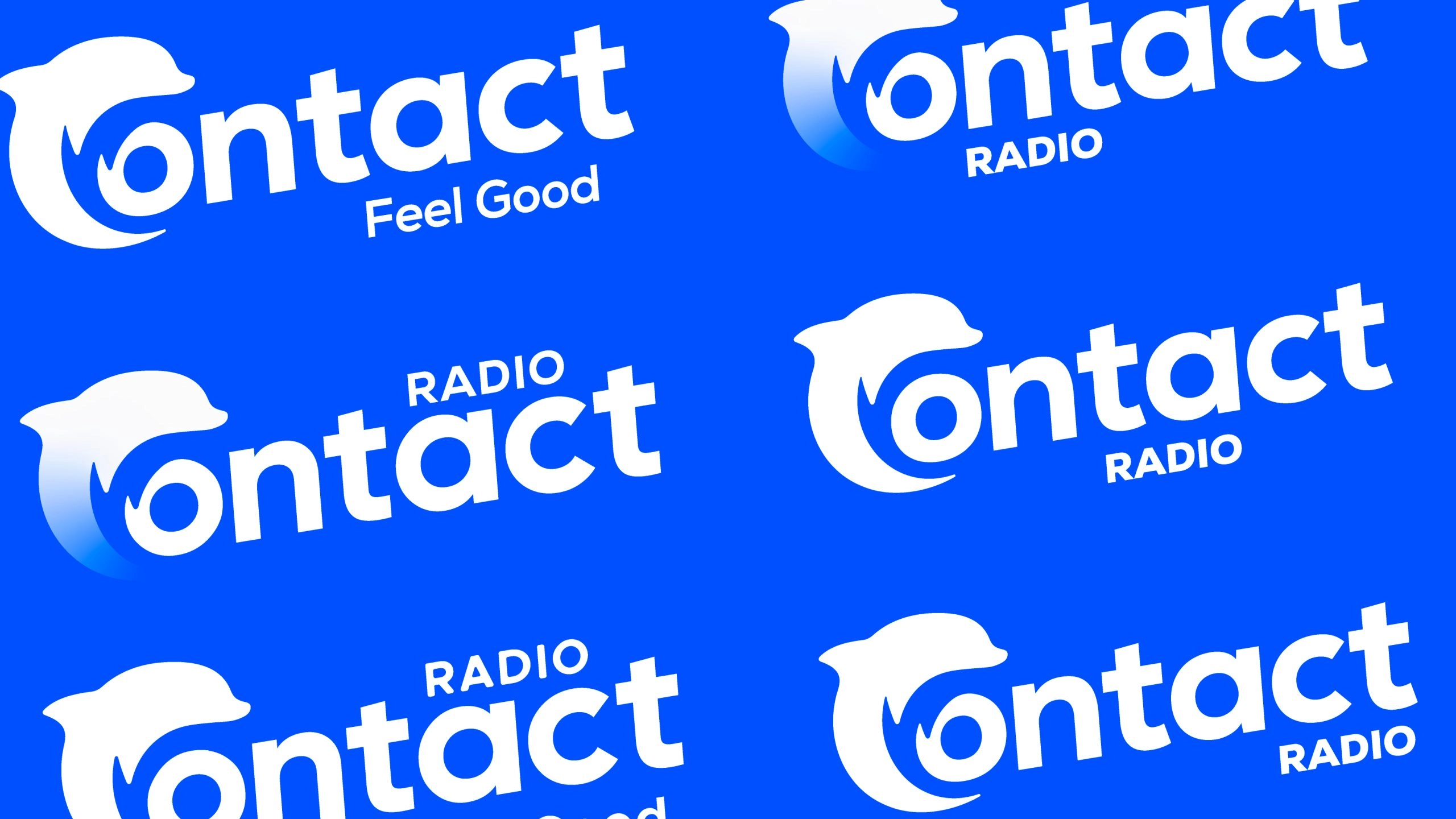
Every detail of the logo was carefully designed to reflect the values and image Radio Contact holds in the eyes of its audience : its curves, its style, the typography, its weight, the tilt, the colors, the placement of the words, and more.
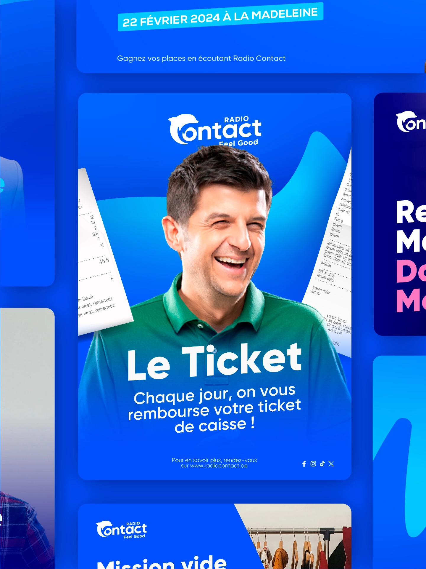
The entire visual identity is built on a subtle harmony between its different elements. The curves of the Contact dolphin take a central place in the brand’s graphic universe, allowing its visuals to be easily recognizable and immediately associated with Radio Contact.
We defined a specific “Contact Blue,” more energetic and fresh, which embodies this new identity. It is accompanied by two additional shades of blue, while new secondary colors enrich the palette. This chromatic diversity offers each of Radio Contact’s web radios a unique graphic universe.
Today, we can see a “new” Radio Contact : more dynamic, more welcoming, refreshed with modern colors and shapes, while remaining true to the values that have made the Belgian radio successful. This new dolphin, a symbol of renewal, is ready to continue its journey and slip into the hearts of listeners… to bring them even more Feel Good !